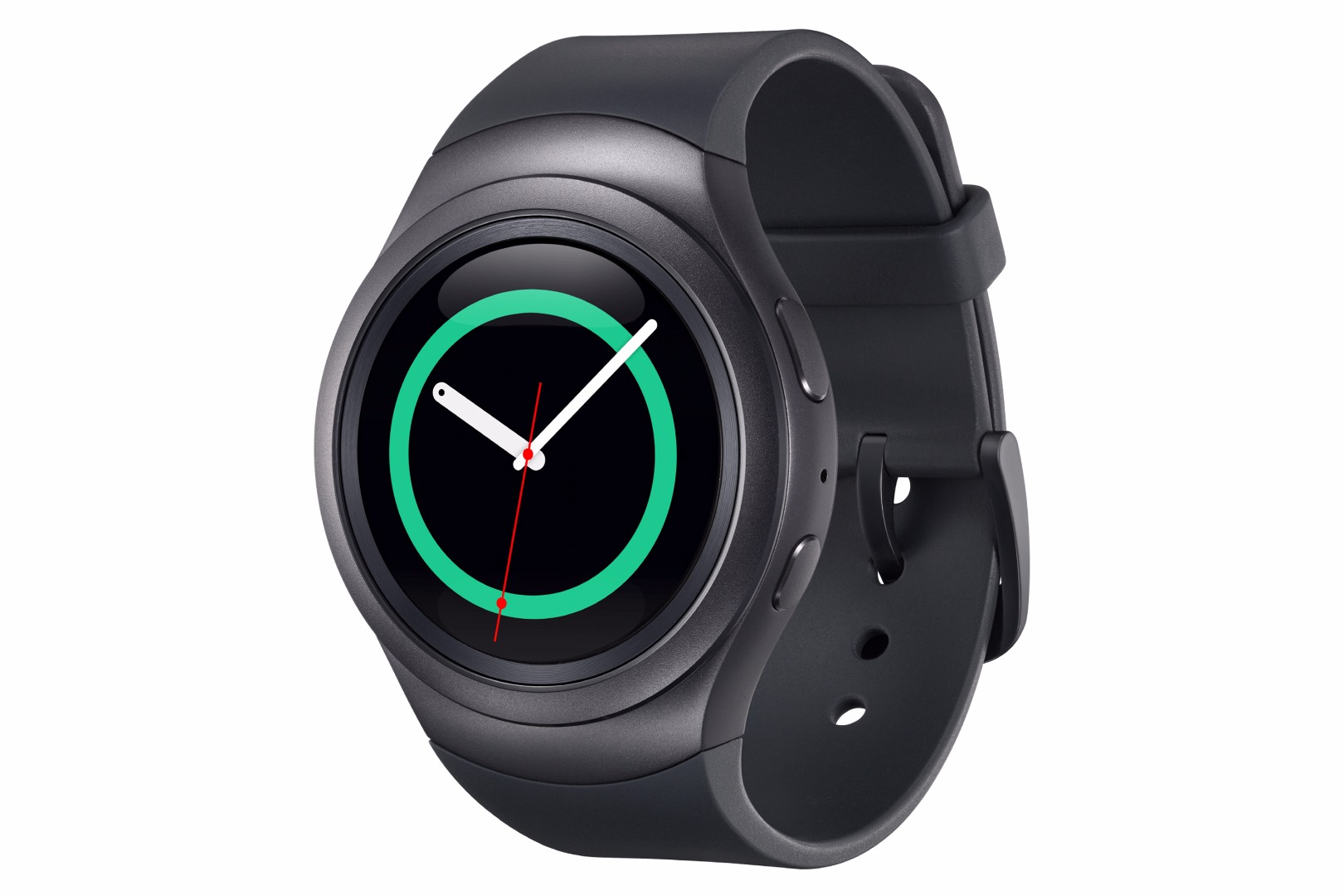
Samsung Gear S2
Organization : Samsung Research America – Think Tank Team
Date : Jun. 2014 - Feb. 2015 Team : Sangwoo Han (UX/Interaction designer), Sajid Sadi(Project manager), Link Huang (UI motion designer), Eva-Maria Offenberg (UI designer), Cathy Kim(UI Designer), Curt Aumiller(Lead Industrial designer), Jiawei Zhang(Industrial designer), Chengyuan Wei(Industrial designer)
1. Project Goals
The Samsung Gear S2 comes in a versatile, circular design with an intuitive, custom UX and advanced features that enable users to enhance, personalize and bring more fun to their mobile experience. The goal of the project was to create a device that delivers right information at the right time with strong UX design leveraging its unique hardware. The Gear product family was struggling from the lack of compelling product vision and strong UX design. The ultimate goal of the Think Tank Team’s design group was to develop a production-ready prototypes and detailed documents that captures our product vision, design frameworks, design strategy, product requirements, and product features. As the only UX / interaction designer in the project, my role was to conduct user research, design the entire core OS framework and interaction models, and create UI design system tookit.
2. User Research
Since the previous Gear products had a small user pool in US, I had to reach out to a user group for user research. The sessions consisted of in-depth interviews and contextual inquiries. After a series of online sessions, we could come out with a few key discoveries.
-
People who are in circumstances where their physical access to smart phones is limited found Gear to be a necessary device.
-
People who don’t prefer to use smartphone frequently enjoyed using Gear.
-
Overall, owning Gear dramatically decreased frequency of engaging smart phones. Which means majority of the tasks, such as reading messages, emails, getting notifications, that people perform with their smartphone can be done with much smaller, simpler devices.
-
Most frequently used Gear features are notifications, messages, weather, and pedometer.
-
There’s inevitable gap in information flow from Gear to a smart phone.
From the user research, we decided that the Gear S2 must be a general-purposed device delivers the right information and features at the right time, without hassle of using bigger smart devices. Furthermore, the smart watch had to collect user data through sensors to provide more personalized experience.
3. Interaction design
The Gear S2 had three distinctive hardware constaints determined before I joined the project that defined the interaction design direction.
- It’s a watch
- It has the world’s first fully circular display
-
The bezel around the screen rotates
My job as an interaction designer is to come up with design frameworks, information architecture, interaction models, and UI systems to deliver most intuitive user experience.
3-1. Case Study 1 : Rich Notification / Widget system
The previous Gear devices had traditional app-launcher OS structure which is a direct adaptation from smartphone OS design. It was a familiar design that didn’t require any learning curve, but was failing to provide user experience that suits its medium. I designed the new OS launcher with more rigorous UX with simpler interaction patterns, and clear mental model.
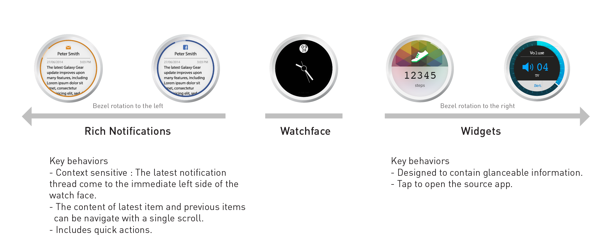
The new Rich Notification / Widget OS design was designed around 3 core UX.
-
Simpler interaction model : Leveraging the bezel rotation and context-sensitive design approach, dynamic information such as new messages, new emails, social media notifications are always one bezel-tick away.
-
Clear mental model : A simple mental model was extremely important to build compact, scalable, and sustainable design system. The new mental model was designed to plant a simple idea in user’s mind; turn the bezel left for notifications, right for widgets. The users never get lost in this system even without any indicator.
- Intuitive userflow : By enhancing functionalities of notifications and widgets, users can take care of thier most frequent tasks such as reading or replying to messages on S2 immediately after they confirmed them. If they need an access to more advanced features, users can jump right into the mobile app from its Rich notification or apps on S2.
The design went through numerous iterations with rapid prototyping, and was tested and validated by user testings.
3-2. Case study 2 : Interaction models
Gear S2’s bezel rotation was a powerful hardware interaction idea, but it needed proper interaction designs to become the center piece of the product. Working with the team’s mechanical engineer, we focused on mainly two aspects – the number of rotation steps and the feel of it. We’ve prototyped and tested various designs and materials, and measured the friction patterns to finalize the bezel design. The final candidates were two – a mechanism using springs, and another design using magnets. The magnet was considered to be a better design from internal testings, but eventually the spring was chosen due to manufacturing issues. The number of detent was defined as 60.
With the hardware interaction design determined, I worked on the software interaction models that can synergize the rotating bezel. Since the it was a completely new interaction, this process involved creation of new consistent mental model and visual indicators.
4. Outcome
Gear S2 had launched October 2015, and became the second most sold smart watch in the world of the year. The product received positive press reviews, especially on the UX design.
A clinic on what a smartwatch should be - The Verge
“The S2’s new user interface perfectly complements the rotating bezel, as well. It’s fast and easy to understand, unlike the byzantine menus on the Apple Watch or Android Wear. Turn the ring to the right from the watchface and you access widgets of information; turn it to the left to see your notifications. Notifications can be filtered and are interactive, even with third-party apps, just like on Android Wear.”
A real rival to Apple Watch and Android Wear - Tech Radar
“The Gear S2 takes the best of each OS, and combines them to create the best UI we've seen on a smartwatch.”
The UX design I delivered has been carried over to the latest generation of the product line.