FF Navigation
Organization : Faraday Future
Time : Jan. 2017 - Sep. 2018
Project team : Sangwoo Han (Lead UX/UI designer), Isabelle Hoogland(Product manager), Yongge Hu, Chaojun Xue, Jiajun Liu, Johnson Zhang, Maulik Shah(Android developer)

1. Project goal
FF 91 is Faraday Future’s first production vehicle and flagship model. All-electric, autonomous-ready and seamlessly connected, it embodies the latest mobility advancements in performance, intelligence, and user experience. In this context, the in-car native navigation app became incredibly important piece of FF91’s digital product ecosystem. Although navigation app is one of the most saturated product categories that have a number of clear winners, after the initial research, the team came to the conclusion that a native navigation app, FF Navigation, equipped with specialized features would greatly improve the user experience. As a lead UX/UI designer, I led all the design related efforts of the project, from performing user research, defining design goals, designing interaction frameworks and design system, execution, and user testing.
2. User Research / Defining UX challenges
User researches were done in two phases. First, I did in-person interviews with Faraday’s employees who own electric vehicles. The questions were not limited to just usage of navigation apps; I framed the research to cover general user experience to discover vehicles’ usability problems, not just apps’. I had conducted about thrity interviews over two weeks.
After the user interview stage, I moved onto the contextual inquiry with the same group of people. I first set up cameras in participants’ vehicles for one or two days to get candid footage of everyday driving experiences. After collecting the videos, I sat down with the candidates, watched them together, and had rather casual conversations. From these researches, I extracted following three UX challenges that I wanted to address with FF Navigation;
- During drive usability
- Reduce the range anxiety
- Voice AI Integration
3. UX flow
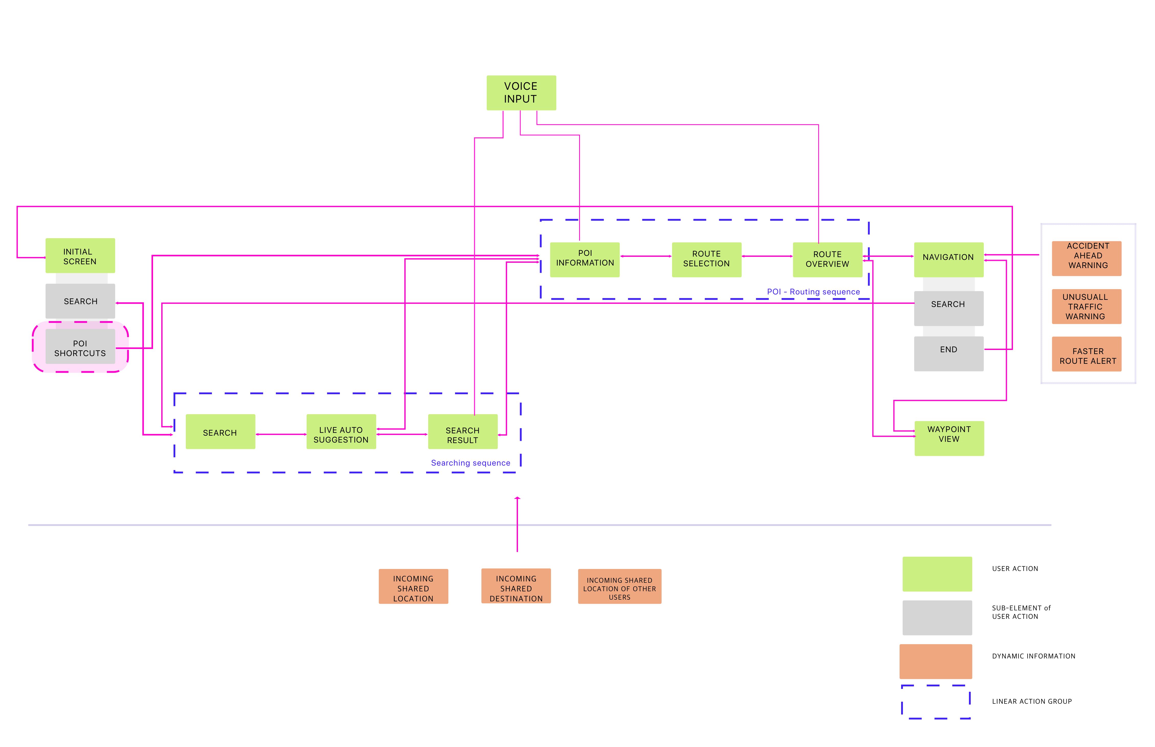
On top of delivering common features like search for places, displaying place information, and guidance, the UX flow addesses some of distinctive features that are unique to FF91, such as advanced voice interaction, cross-platform connectivity, and vehicle feature integrations.

Example of basic search user flow based on the diagram.
3. During drive experience – Ergonimics study

<
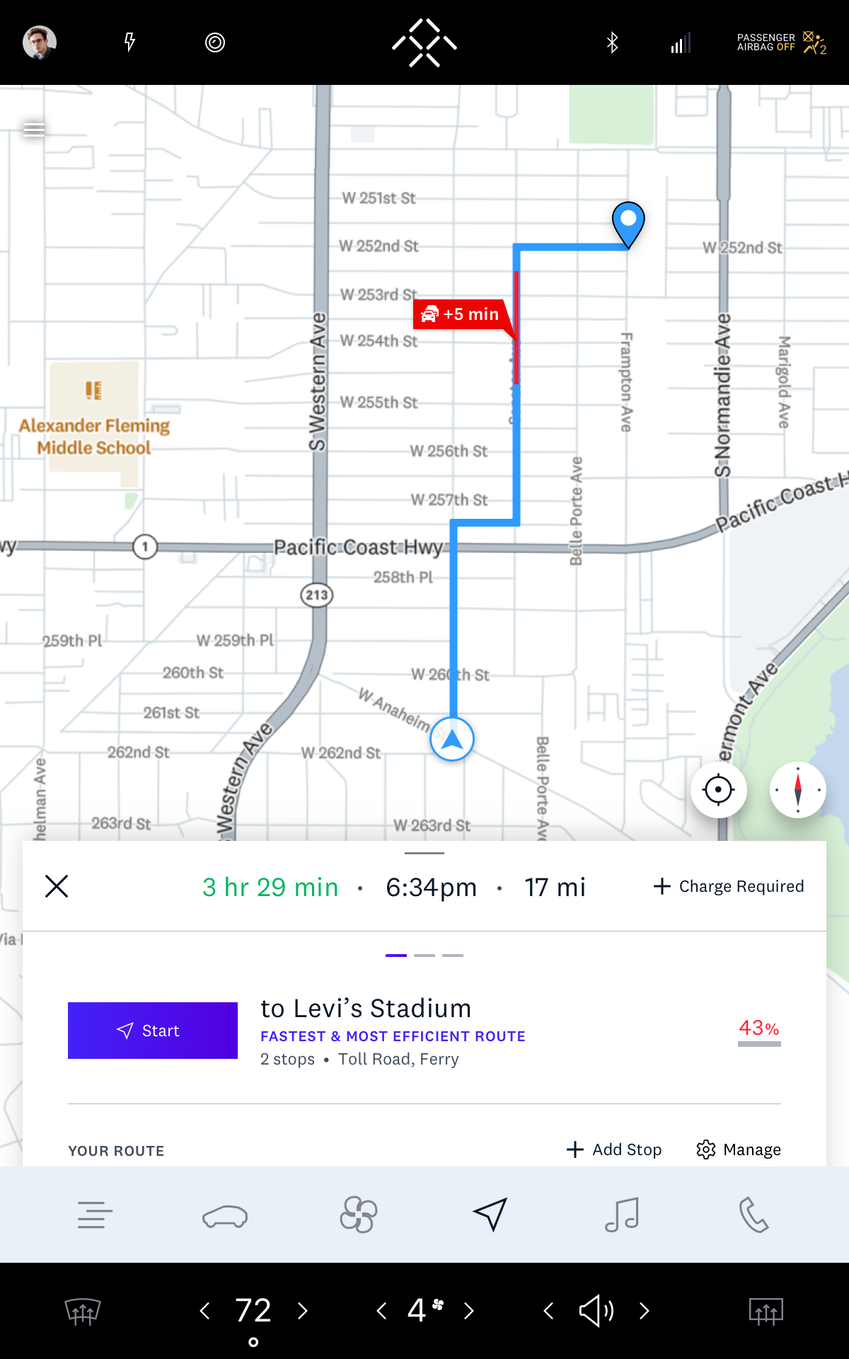
To analytically understand our users, I worked with the human factors team to observe how being a driver, and having a touch screen affect the usability. We determined various ergonimics factors for the center display, including button sizes, font sizes, and color contrast. More importantly, we did a lot of researches on reachability and legibility of the screen. The picture on the left shows the result of them – simply put, due to the positioning of the screen and the driver, the only glancible part of the screen is the upper half of the screen, whereas the lower part is the interaction-friendly area. Based on the research, I had defined the design frameworks that was going to be the building blocks.>
- Placed visual information on the upper side, while text information is located on the botton side. In order to systematically deliver this idea, I strictly designed every screen in a combination of map + a bottom-positioned floating card. The map view is responsible for map markers and route graphics, whereas the card contains mostly detailed texts.
- There is only one emphasized primary button. Since it is challenging to build a muscle memory with touch screen, the driver has to scan the center display everytime she or he interacts with it. Also, because most of the interactions are focused on the bottom side, I wanted to create an extreme visual hierachy to improve scannability.
- Another design challenge was to position key interactions on the driver side, so that the driver doesn’t need to stretch the arm which can be extremely distractive.
4. Reducing range anxiety
One of the biggest part of eletric vehicle drivers’ lives is concerning about battery level. This is also why Tesla drivers were strongly satisfied with their navtive navigation app from our user research – because the app automatically maps charging stations along the route. My challenge was to design a competitive system with our limited access to database, and discovering opportunities to even more aggressively reduce range anxiety.
- Advanced Trip Planning
‘Trip planning’ was strategically emphasized as a major feature. It allows the user to plan a trip ahead of navigation. The user flow below describes a normal trip planning feature.
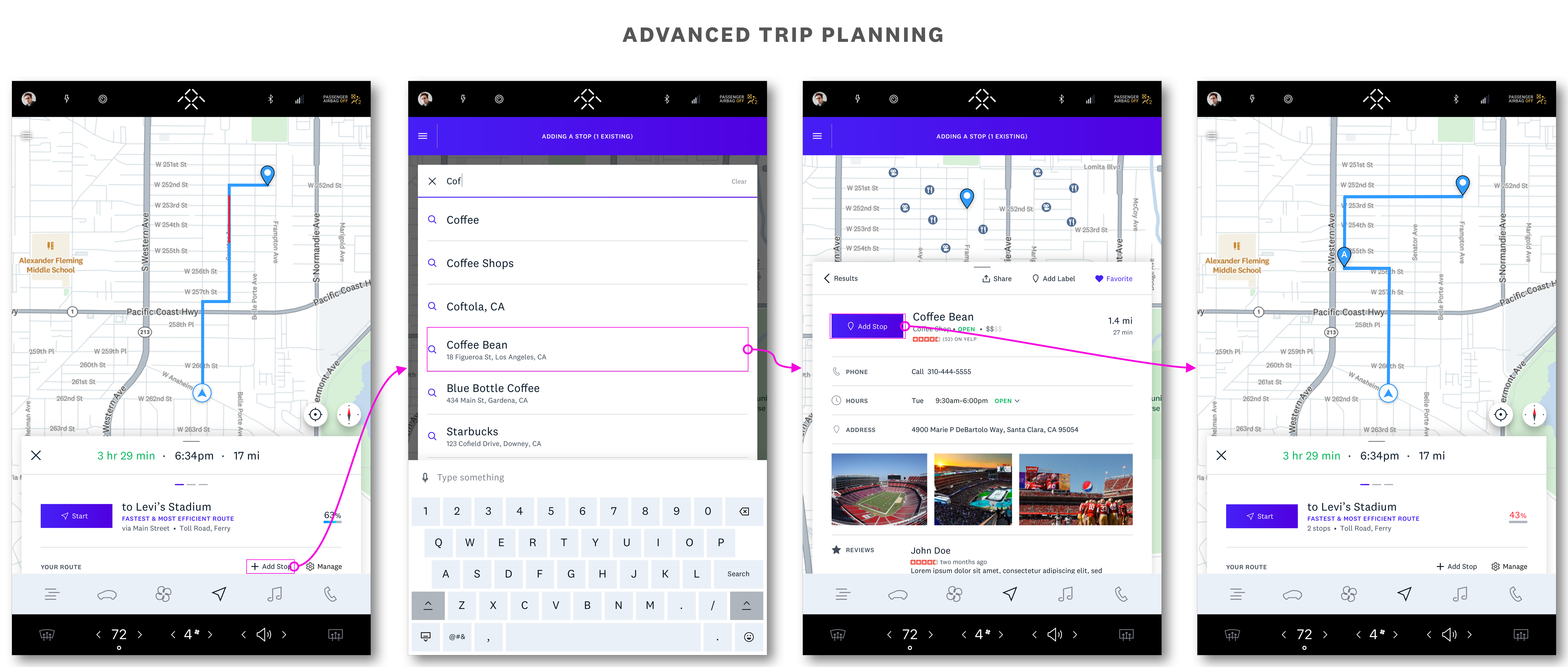
However, if the estimated battery level goes below zero, a new ‘Charge Required’ button appears. This button initiates a sub flow that searches charging stations that can provide enough charging to reach the destination.
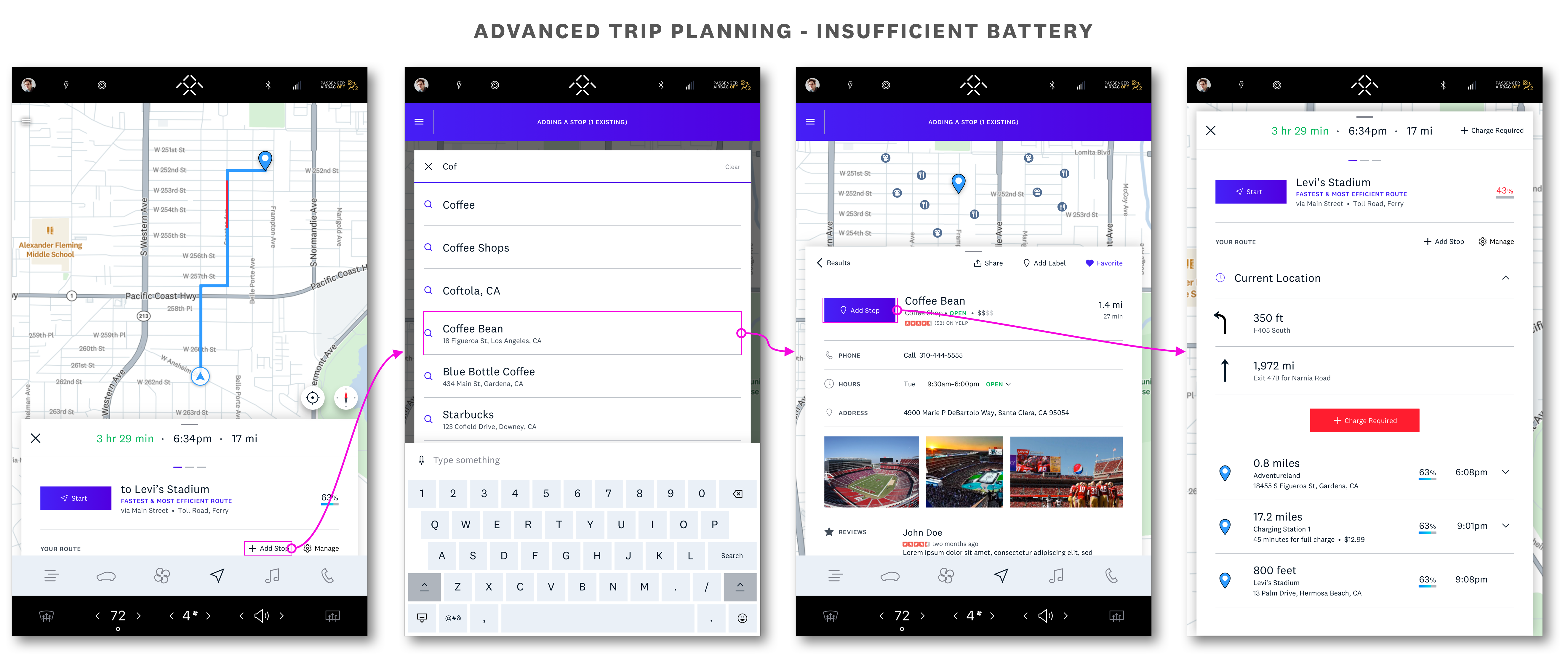
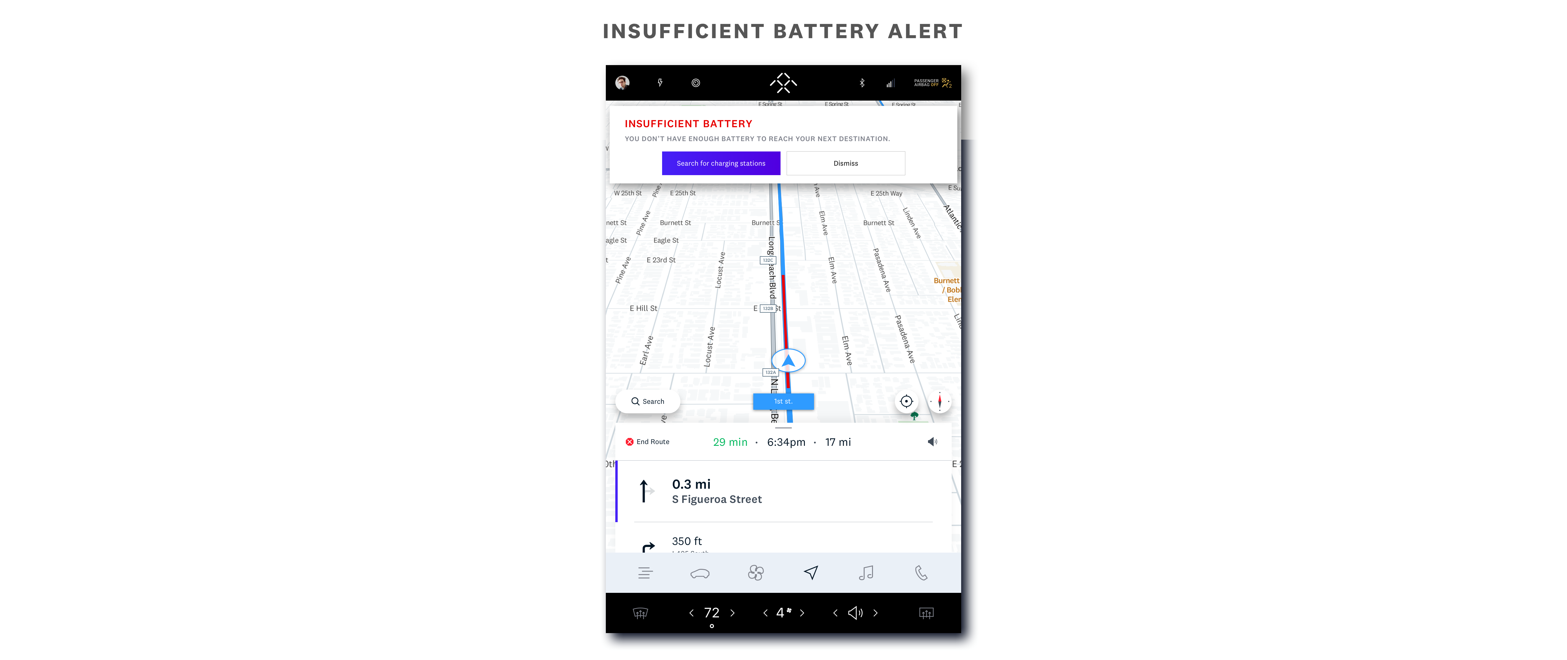
- Insufficient Battery Alert
In addition, if FF Navigation figures the current battery level is not sufficient to reach the destination during guidance, it pushes an system alert with an option to search for charging stations.
5. Voice AI Integration
FF91 is an AI-first vehicle, therefore it was important that FF Navigation’s design would serve as a part of the bigger AI UX architecture – FFAI. On top of basic searching and navigating features, FFAI provides conversational interaction to help the driver access the system without having to interact with the touchscreen.

6. Test & Validation
Due to the nature of unreleased product, a strategic approach for user testing and validation strategically. I structured the testing session in 3 different stages.
1. Low-fidelity paper prototyping : As the most frequently executed testing method, paper prototyping was used to validate interaction design ideas quick and fast. The cadidates are mostly teammates.
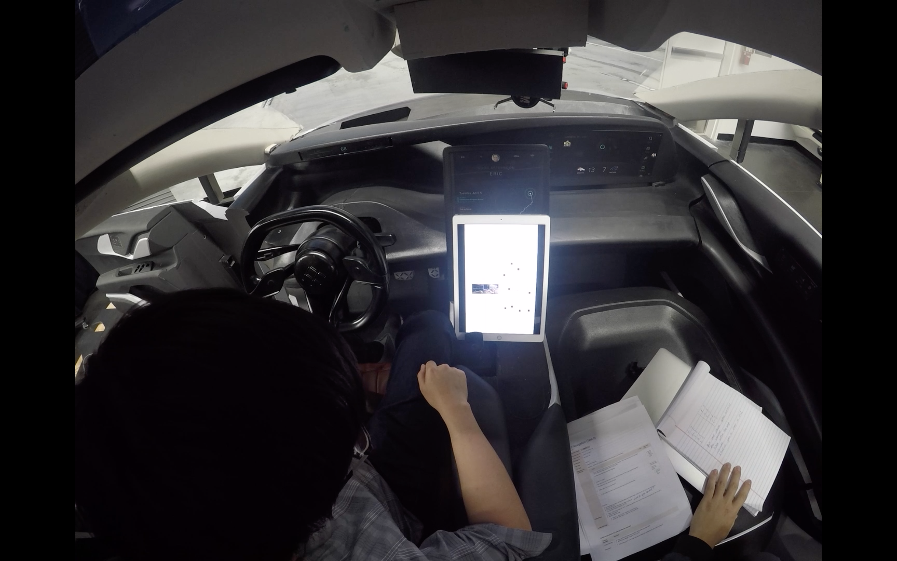
2. Mid-fidelity Framer prototyping : Framer is my go-to prototyping tool. It’s fast and rigorous. To test a certain section of user flow, I aggressively used Framer prototypes and testing car(picture above). We conducted this user testing every 4-5 weeks to get user data to design on.
3. High-fidelity Android prototyping : For holistic user testing, I used beta builds from developers. The prototype was installed and set up in our testing vehicles, and candidates drove the vehicles for a couple of days. With this approach, I managed to get the bigger picture on the impact of UX designs on the product and user experience.